Matplotlib in Python: Visual Guide & Examples
Learn how to use Matplotlib in Python with step-by-step explanations and example code. 🔵

Visually Explained
11.6K views • Jan 20, 2025
About this video
🔵 Example code: https://rebrand.ly/kg1qk17
🔵 Chapters
00:00 - Intro to Matplotlib
00:29 - Install Matplotlib
00:35 - Import pyplot module
00:54 - Plot data
01:16 - Change x-axis values
01:34 - Add title and axis labels
02:18 - Add data point markers
02:43 - Add horizontal line
03:11 - Use colors / line styles
03:43 - Add a legend
04:15 - Use dot notation
🔵 Matplotlib
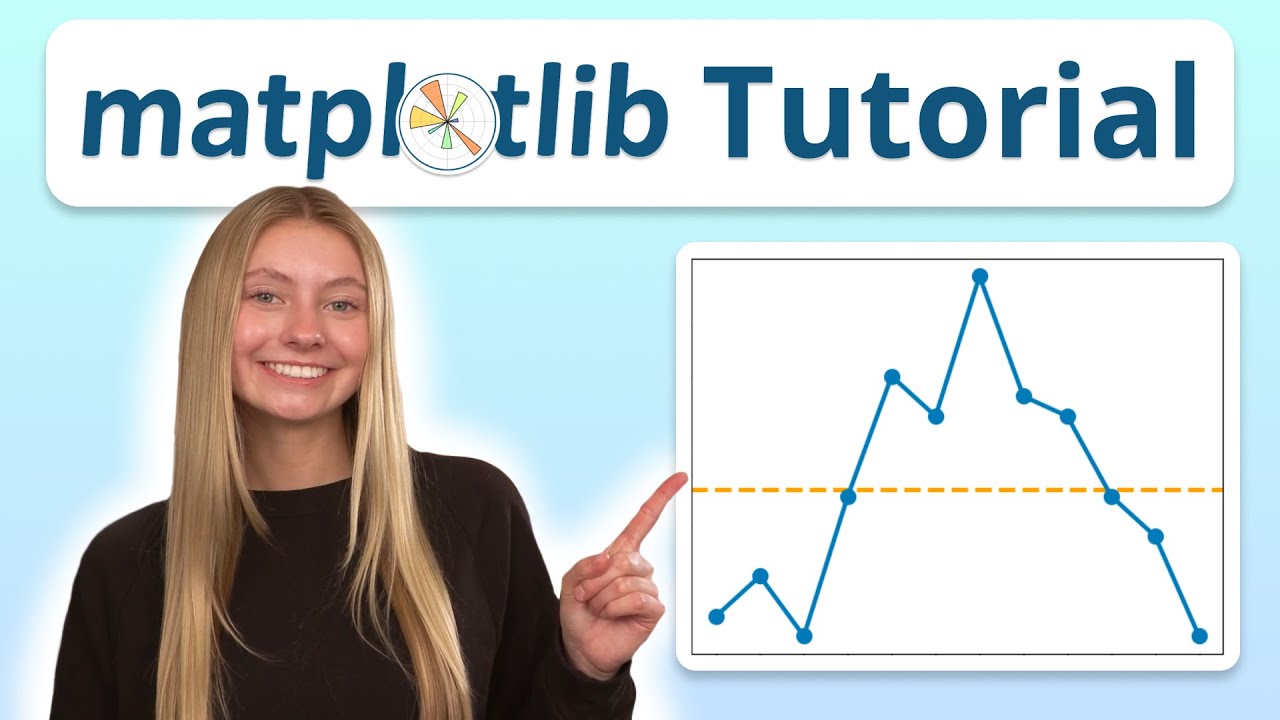
In this video, you will learn how to visualize data in Python using Matplotlib. Formatting options discussed in the video:
1. plt.plot()
- marker: Shape of the data points (e.g., "o", "s", "^", "*").
- label: Legend label for the data series (e.g., "Sunny days").
- color: Customize the line color (e.g., "blue", "green").
2. plt.title()
- Title text (e.g., "Sunny days").
- Font size: fontsize=14 or any desired value.
- Font style: Use fontweight (e.g., "bold", "light").
3. plt.xlabel() & plt.ylabel()
- Label text (e.g., "Months", "Sunny days").
- Font size: fontsize=12 or your preferred size.
4. plt.axhline()
- y: The y-coordinate value for the line (e.g., avg_sunny_days).
- linestyle: Customize line style (e.g., "--", "-.", ":").
- color: Customize line color (e.g., "orange", "red", "gray").
- label: Legend label for the line (e.g., "Average").
5. plt.legend()
- Location: Specify where the legend appears (e.g., "upper right", "lower left", "best").
- Font size: fontsize=10 or your preferred size.
#Python #CodingTips #PythonTutorial #LearnPython #PythonProgramming #CodingForBeginners #ProgrammingTips
🔵 Chapters
00:00 - Intro to Matplotlib
00:29 - Install Matplotlib
00:35 - Import pyplot module
00:54 - Plot data
01:16 - Change x-axis values
01:34 - Add title and axis labels
02:18 - Add data point markers
02:43 - Add horizontal line
03:11 - Use colors / line styles
03:43 - Add a legend
04:15 - Use dot notation
🔵 Matplotlib
In this video, you will learn how to visualize data in Python using Matplotlib. Formatting options discussed in the video:
1. plt.plot()
- marker: Shape of the data points (e.g., "o", "s", "^", "*").
- label: Legend label for the data series (e.g., "Sunny days").
- color: Customize the line color (e.g., "blue", "green").
2. plt.title()
- Title text (e.g., "Sunny days").
- Font size: fontsize=14 or any desired value.
- Font style: Use fontweight (e.g., "bold", "light").
3. plt.xlabel() & plt.ylabel()
- Label text (e.g., "Months", "Sunny days").
- Font size: fontsize=12 or your preferred size.
4. plt.axhline()
- y: The y-coordinate value for the line (e.g., avg_sunny_days).
- linestyle: Customize line style (e.g., "--", "-.", ":").
- color: Customize line color (e.g., "orange", "red", "gray").
- label: Legend label for the line (e.g., "Average").
5. plt.legend()
- Location: Specify where the legend appears (e.g., "upper right", "lower left", "best").
- Font size: fontsize=10 or your preferred size.
#Python #CodingTips #PythonTutorial #LearnPython #PythonProgramming #CodingForBeginners #ProgrammingTips
Tags and Topics
Browse our collection to discover more content in these categories.
Video Information
Views
11.6K
Likes
728
Duration
5:07
Published
Jan 20, 2025
User Reviews
4.6
(2)