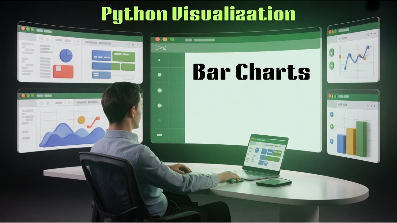
Creating Stunning Bar Charts in Python with Matplotlib & Seaborn
Learn to create bar plots in Python to visually compare categorical data. This guide covers vertical and horizontal bars, color customization, and effective labeling.
classeswithme
35 views • Nov 3, 2025
About this video
Learn to make bar plots in Python and compare categorical data visually.
We’ll explore vertical & horizontal bars, color customization, and labels that make your insights shine.
📌 Key Concepts
🧑💻Matplotlib & Seaborn bar chart basics
🧑💻Customizing axes, legends, and annotations
🧑💻Grouped & stacked bar charts
🧑💻When to use bar plots in real projects
📧 Email: classeswithme@gmail.com
📂 Playlist: https://youtube.com/playlist?list=PLjx_MccGVovzCOaI2woJHJjx1XaoDBRdf&si=9iUu4tAjaG0oS2KJ
▶️ Next Video: https://youtu.be/pPW_Bto55C0
💻 Python Project Video: https://youtu.be/eQtBm-_ILSk
☁️ Google Drive Resources: https://drive.google.com/drive/folders/1CDicRG6PP3s7ZEY4o2-7sGaRpS7UkiIY?usp=sharing
#PythonBarPlot #matplotlib #seaborn #datavisualization #pythontutorial #analytics #visualization #pythonforbeginners
Video Information
Views
35
Duration
9:16
Published
Nov 3, 2025
Related Trending Topics
LIVE TRENDSRelated trending topics. Click any trend to explore more videos.
No specific trending topics match this video yet.
Explore All Trends