Create Stunning Matrix Plots & Heatmaps in Python 📊
Learn how to transform your data into professional, publication-ready heatmaps with our easy step-by-step Python tutorial. Perfect for visualizing complex data!
AI_Evolutionary Technology
2 views • May 12, 2025
About this video
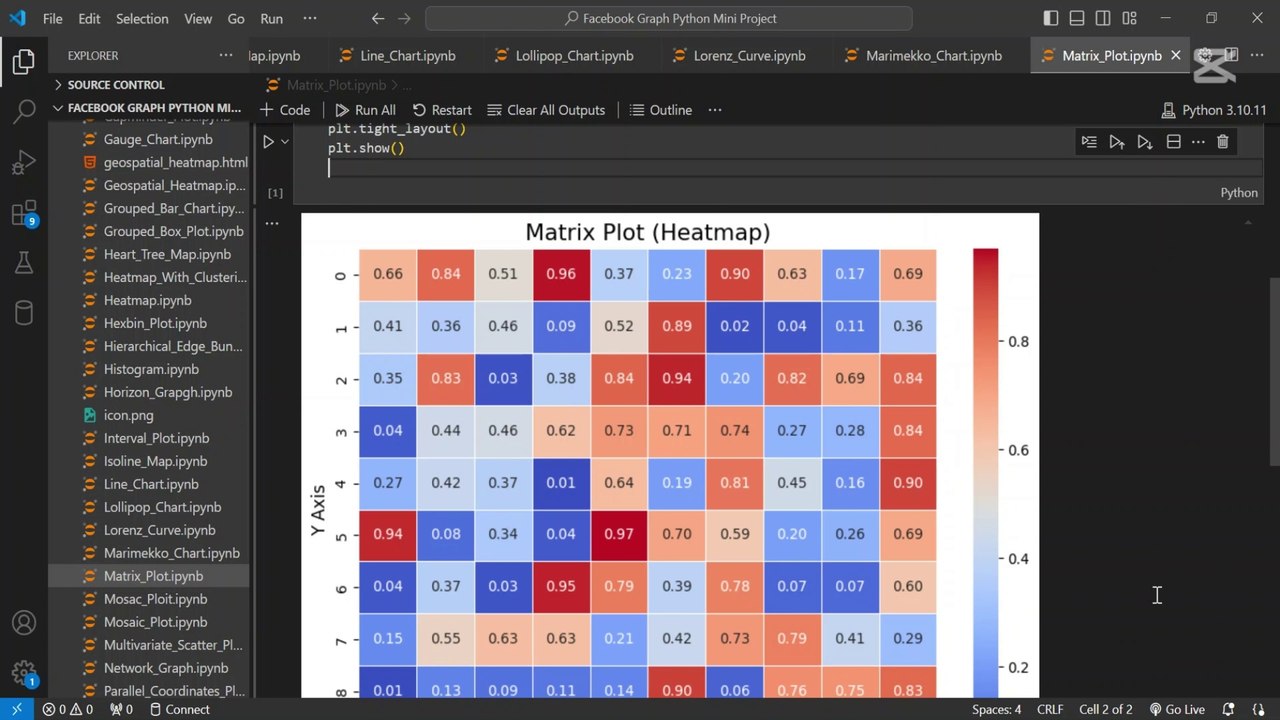
🔥 Transform your data into stunning heatmaps with Python! In this step-by-step tutorial, I’ll show you how to create professional, publication-ready heatmaps using Seaborn and Matplotlib. Perfect for data analysis, machine learning, or academic research!<br /><br />📌 What You’ll Learn:<br />✔️ How to generate a heatmap from scratch in Python<br />✔️ Customizing colors, annotations & labels for clarity<br />✔️ Pro tips to make your heatmap visually impressive<br />✔️ Real-world applications for data science & analytics<br /><br />📢 Subscribe for more Python & Data Science tutorials!<br />👉 Hit the 🔔 Bell Icon to get notified when I upload new videos!<br /><br />#Python #DataVisualization #Seaborn #Matplotlib #Heatmap #DataScience #Coding #PythonTutorial<br /><br />#Python #DataVisualization #Seaborn #Matplotlib #Heatmap #DataScience<br />#PythonTutorial #Coding #MachineLearning #DataAnalysis<br />#LearnPython #Programming #AITools #TechTutorial #DataViz
Video Information
Views
2
Duration
2:06
Published
May 12, 2025
Related Trending Topics
LIVE TRENDSRelated trending topics. Click any trend to explore more videos.
Trending Now