Master the Art of Dashboard Presentation: Engage & Inspire Your Audience 📊
Discover the key to presenting dashboards effectively by focusing on user benefits instead of just features. Learn proven techniques to captivate your audience and deliver impactful insights.

The Hidden Speaker
12.7K views • Jun 17, 2023

About this video
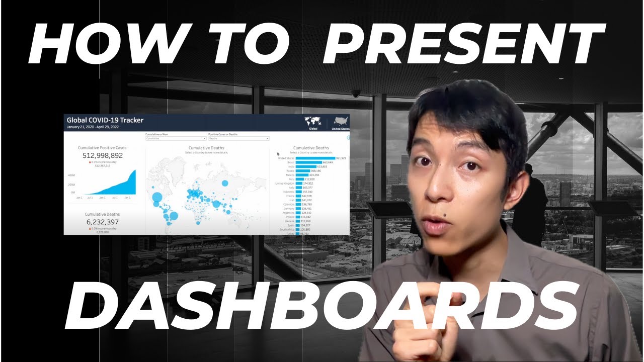
The wrong way to present a dashboard is by describing features. In this video I demonstrate the right way: talking about the benefits for the end users and walking them through relevant examples.
Are you a tech professional who wants to take your career to the next level?
Get My Free 140+ Pages of Speaking Tips:
https://thehiddenspeaker.com/landing-page
And Connect with Me on my Other Platforms:
LinkedIn: https://www.linkedin.com/in/cchiddenspeaker
Website: https://www.thehiddenspeaker.com/
Email: info@thehiddenspeaker.com
About Me:
I’m Christopher Chin, and I help tech professionals become confident speakers and leaders.
Does this sound familiar:
- You put together slide decks but your audience doesn’t react well to them?
- You’re great at researching, coding, and analyzing. But don’t know where to start with speaking up in meetings and giving presentations?
- You’ve been stuck in your career, unable to get the promotions you deserve, because your managers say you need to work on communication skills?
The truth is communication, presentation, and storytelling are not “soft skills”. They are extremely hard to master yet crucial for success in business and leadership.
I created this YouTube channel and my Hidden Speaker training programs to address exactly those challenges. This is not just any communication course. This is communication for tech professionals by a tech professional. If you're looking for self-paced content to overcome anxiety, speak with confidence, and know how to structure a killer presentation, you’ve come to the right place.
Subscribe to my Youtube channel and smash that LIKE button if you want to see more videos like this:
https://www.youtube.com/channel/UCAy6HVPjo8zGgBRLUnX-X8g/?sub_confirmation=1
Transcript:
I'm going to show you the good way and the bad way to present a dashboard. Let's start with the bad way. "We implemented some new features in our dashboard. At the top right there's a toggle between Global and United States and in the middle now we have two filters - cumulative, new, and positive cases/deaths." Think about how that compares to what I'm going to show you next. "We implemented some new features in our dashboard. Let's say you're a health official in New York City. You want to see the exact number of new positive cases. To do that you start at the top right and switch from Global to United States, and in these three filters in the middle switch them from cumulative to new, deaths to positive cases, and finally enter the state of interest which is New York." Remember, don't tell the audience what you did. Show them a concrete example so they can understand its impact
#communication #publicspeaking #data
Video Information
Views
12.7K
Likes
315
Duration
0:49
Published
Jun 17, 2023
User Reviews
4.6
(2) Related Trending Topics
LIVE TRENDSRelated trending topics. Click any trend to explore more videos.
Trending Now