Create Clear Difference Charts in Excel with Arrows & Labels 📊
Learn how to visually compare two lines in Excel by highlighting differences with arrows and data labels. Follow this easy step-by-step guide to make your charts more insightful and professional!
RBX Excel videos
27.1K views • Jul 21, 2025
About this video
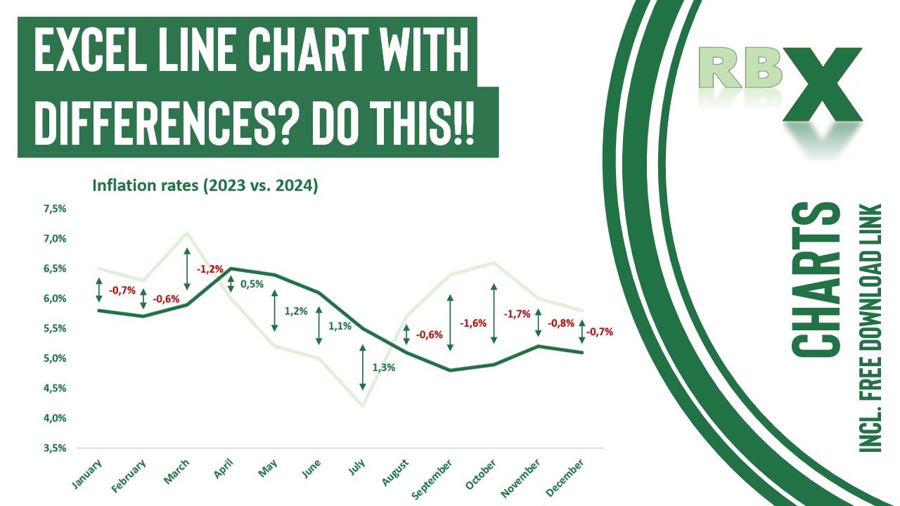
📊 Want to show the difference between two lines in Excel—with arrows and data labels—just like a pro? In this step-by-step tutorial, you'll learn exactly how to create a stunning line chart in Microsoft Excel that visually compares two data series (like 2023 vs. 2024 inflation rates).
We'll cover:
✅ How to build helper columns for average and difference
✅ Adding dynamic arrows between lines
✅ Custom data labels showing exact differences
✅ Smart formatting tips for a clean, professional look
✅ How to hide helper columns without breaking your chart
This chart is perfect for dashboards, reports, and presentations where you want to show not just the trend—but the story behind the numbers.
🎯 Whether you're a beginner or Excel enthusiast, this trick will level up your charting game instantly!
Download link to the excel file used in the video: https://drive.google.com/uc?export=download&id=10o4hYbGXKqWrsjrU9OawkLKIGnP1iyHP
00:00 - Intro
00:50 - Create functions for helper columns
03:02 - Insert the chart
03:36 - Add the helper lines and data labels
07:11 - Add the arrows (error bars)
08:44 - Final formatting
Tags and Topics
Browse our collection to discover more content in these categories.
Video Information
Views
27.1K
Likes
1.3K
Duration
11:04
Published
Jul 21, 2025
User Reviews
4.6
(5) Related Trending Topics
LIVE TRENDSRelated trending topics. Click any trend to explore more videos.
No specific trending topics match this video yet.
Explore All Trends