Create Stunning Line Charts in Excel & Add Vertical Lines Easily 📊
Learn step-by-step how to make professional line charts in Excel and enhance them by adding vertical reference lines. Perfect for Office 365 users! Timestamps included.

Excel Up North
14.6K views • Oct 3, 2024
About this video
👇 LET'S CONNECT 👇
https://linktr.ee/excelupnorth
—————————————————————
⏰ Timestamps ⏰
00:00 Intro
00:25 Data Overview
00:50 Step 1: Set Up The Line Chart
01:12 Step 2: Add A Vertical Line
04:02 Step 3: Customize The Lines
05:20 Step 4: Finishing Touches
—————————————————————
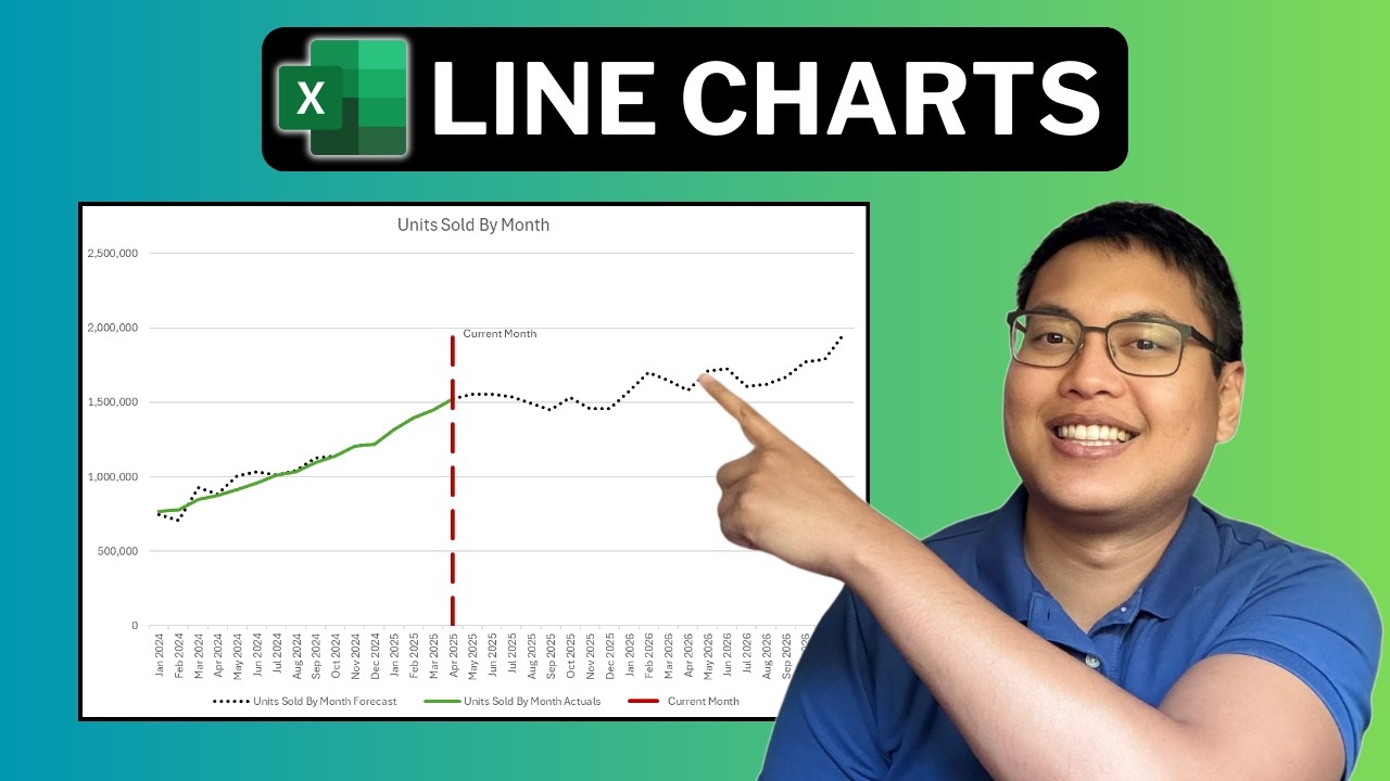
In this tutorial, we’ll walkthrough how to create a dynamic Line Chart in Excel that compares both Actual and Forecast data, with a vertical line marking the current month. This line will update automatically as the data changes, giving you a clear view of your sales or any time-based data, whether it’s in the past or projected for the future. This is a great technique for anyone looking to visually separate historical and forecasted data, making your charts more informative and easier to understand.
Throughout the video, we’ll go step-by-step how to set up the chart, calculate the correct values for the vertical line, and customize the chart for a professional finish. We’ll cover how to use functions like MAXIFS and MAX to find the latest Actual date and set up the line’s x and y values. Plus, I’ll demonstrate how to format the chart lines to clearly differentiate between the past and future data, as well as how to add final touches like labels and a custom chart title.
Whether you're tracking sales, weather patterns, or any other time-based data, this Excel technique will help you create clean, dynamic charts that are easy to update and interpret. Don’t forget to like the video if you find it helpful, subscribe to the channel for more Excel tips and tricks, and hit the notification bell to stay updated on future tutorials!
https://linktr.ee/excelupnorth
—————————————————————
⏰ Timestamps ⏰
00:00 Intro
00:25 Data Overview
00:50 Step 1: Set Up The Line Chart
01:12 Step 2: Add A Vertical Line
04:02 Step 3: Customize The Lines
05:20 Step 4: Finishing Touches
—————————————————————
In this tutorial, we’ll walkthrough how to create a dynamic Line Chart in Excel that compares both Actual and Forecast data, with a vertical line marking the current month. This line will update automatically as the data changes, giving you a clear view of your sales or any time-based data, whether it’s in the past or projected for the future. This is a great technique for anyone looking to visually separate historical and forecasted data, making your charts more informative and easier to understand.
Throughout the video, we’ll go step-by-step how to set up the chart, calculate the correct values for the vertical line, and customize the chart for a professional finish. We’ll cover how to use functions like MAXIFS and MAX to find the latest Actual date and set up the line’s x and y values. Plus, I’ll demonstrate how to format the chart lines to clearly differentiate between the past and future data, as well as how to add final touches like labels and a custom chart title.
Whether you're tracking sales, weather patterns, or any other time-based data, this Excel technique will help you create clean, dynamic charts that are easy to update and interpret. Don’t forget to like the video if you find it helpful, subscribe to the channel for more Excel tips and tricks, and hit the notification bell to stay updated on future tutorials!
Tags and Topics
Browse our collection to discover more content in these categories.
Video Information
Views
14.6K
Likes
86
Duration
7:17
Published
Oct 3, 2024
User Reviews
4.1
(2) Related Trending Topics
LIVE TRENDSRelated trending topics. Click any trend to explore more videos.
Trending Now