Worst Football Logo Changes: Juventus 2015/16 😕
Exploring football crests that worsened after redesign, starting with Juventus's 2015/16 logo, criticized for over-simplification.

lukegerr
27.6K views • Aug 20, 2024
About this video
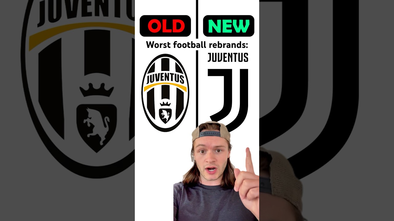
Football crests that got worse after the redesign… Part 1:
Juventus — 2015/16: A classic case of over simplification in modern logo design, this effort saw Juve do away with the shield (used from 1905-1977, then 1989-2016) in favor of the letter J. There’s not much else here to say.
LaLiga — 2023/24: From 1994-2023, the Spanish first division was represented by the iconic ‘color wheel’. Now, it’s just the letters ‘LL’ in a coral pantone that literally just looks like a 4. In my opinion, this is the one of the worst rebrands ever.
Leeds United — 2019/20: In honor of their centenary season, Premier League side Leeds United decided to change their crest, which has remain largely unchanged since 1998. Despite over 6 months of work—including the consultation of “over 10,000” fans, the final product ended up looking more like a bad esports template than a professional football crest. Within days, over 77,000 fans had signed a petition for the club NOT to change the logo, prompting them to forgo the rebrand altogether. Classic.
Which football logo rebrands do you think failed miserably? Comment below for a chance to be featured in part 2 👀
And lastly, big shoutout to twitter user/ STJAMESSAN for the inspo behind this video. #football #logo #design #sports #soccer #futbol #fail #juventus #laliga
Tags and Topics
Browse our collection to discover more content in these categories.
Video Information
Views
27.6K
Likes
1.7K
Duration
0:59
Published
Aug 20, 2024
User Reviews
4.6
(5) Related Trending Topics
LIVE TRENDSRelated trending topics. Click any trend to explore more videos.