Understanding Cumulative Frequency Diagrams and Statistical Measures
Learn how to construct and interpret cumulative frequency diagrams to find the median, lower and upper quartiles, interquartile range, and percentiles such as the 90th percentile.

Radford Mathematics
61.1K views • May 7, 2021
About this video
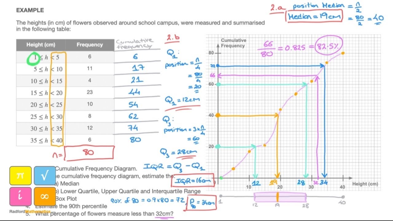
We learn how to draw and use a cumulative frequency diagram to find the median, lower and upper quartiles, the interquartile range, 90th percentile and how to use the diagram to draw a box plot.
******** TIME STAMPS / CHAPTERS ********
00:00 Introduction
00:50 Cumulative Frequency Column
02:13 Plotting Points & Curve for Cumulative Frequency Diagram
04:33 Median Value
05:55 Lower & Upper Quartile
07:37 Interquartile Range
08:02 Median at n/2 or (n+1)/2 ?
09:03 Box Plot
10:22 90th Percentile (How to Find it)
11:54 Percentage Measuring Less than 32cm
Tags and Topics
Browse our collection to discover more content in these categories.
Video Information
Views
61.1K
Likes
1.1K
Duration
13:19
Published
May 7, 2021
User Reviews
4.7
(12) Related Trending Topics
LIVE TRENDSRelated trending topics. Click any trend to explore more videos.
No specific trending topics match this video yet.
Explore All Trends