Show Actual & Forecast Data on One Excel Chart 📊
Learn how to display actual and forecasted values together on a single Excel line chart for clear comparison.

Data Design Style
19.6K views • May 30, 2024
About this video
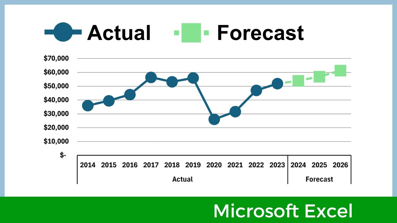
If you have a dataset with actual values and forecasted (or projected) values, this video will show you how to display them together on the same line chart, using Microsoft Excel. There are different methods you could use, this video uses the strategy of (1) putting the Actual and Forecast numbers in two different columns, (2) creating a line chart, and then (3) using a work-around to connect the two lines.
....................................................
CHAPTERS:
0:00 Introduction
0:12 Prep the data
0:38 Create chart
2:24 Format lines
3:43 Connect the 2 lines
5:42 Closing remarks
....................................................
Video is made using Filmora.
Website: https://www.DataDesignStyle.com
....................................................
CHAPTERS:
0:00 Introduction
0:12 Prep the data
0:38 Create chart
2:24 Format lines
3:43 Connect the 2 lines
5:42 Closing remarks
....................................................
Video is made using Filmora.
Website: https://www.DataDesignStyle.com
Tags and Topics
Browse our collection to discover more content in these categories.
Video Information
Views
19.6K
Likes
198
Duration
6:15
Published
May 30, 2024
User Reviews
4.3
(3) Related Trending Topics
LIVE TRENDSRelated trending topics. Click any trend to explore more videos.
No specific trending topics match this video yet.
Explore All Trends