How to Create a Scatter Plot in Python with Category Colors
How to Create a Scatter Plot in Python with Category Colors | Matplotlib TutorialIn this tutorial, you'll learn how to create a scatter plot in Python using ...
AI_Evolutionary Technology
2 views • Jul 12, 2025
About this video
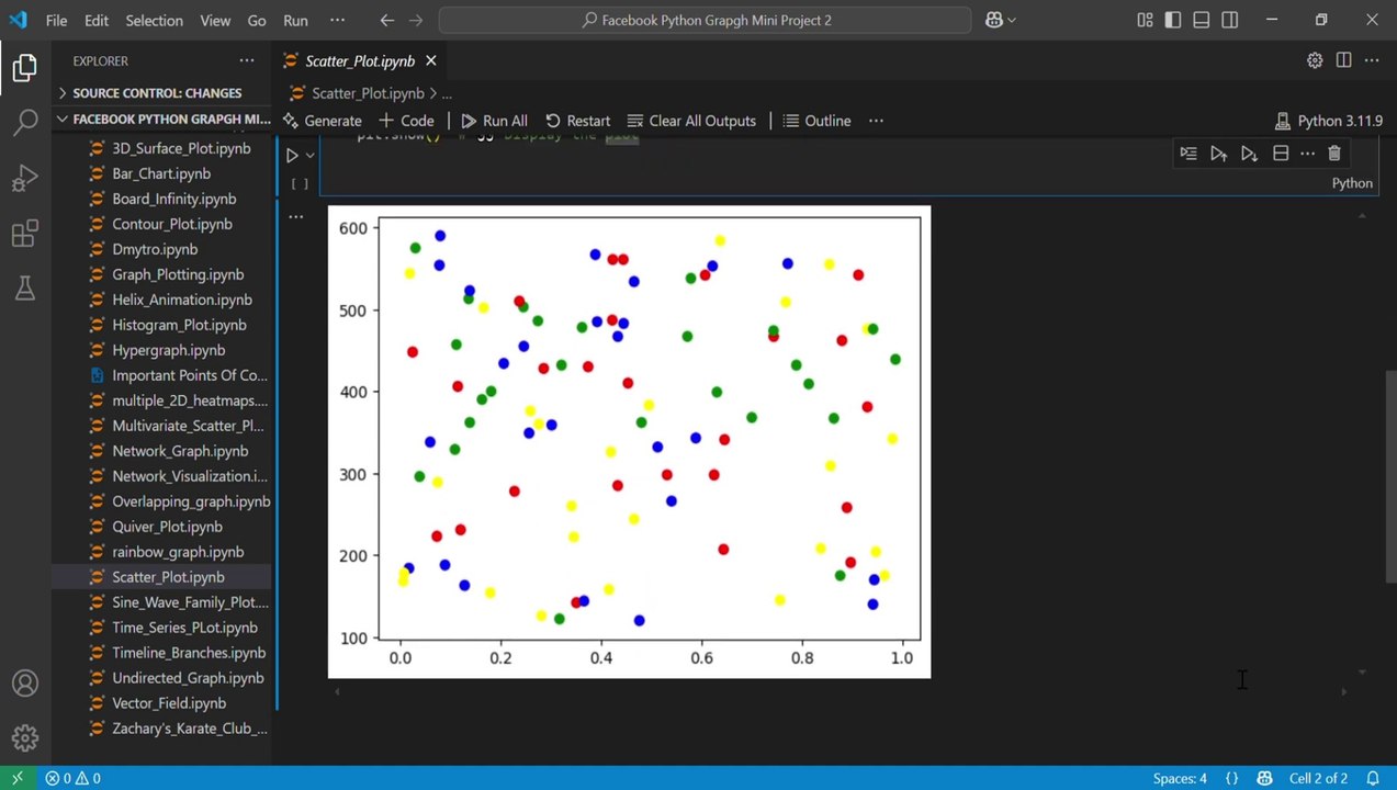
How to Create a Scatter Plot in Python with Category Colors | Matplotlib Tutorial<br />In this tutorial, you'll learn how to create a scatter plot in Python using Matplotlib, with category-based color coding using pandas.<br />Github Link:https://github.com/nazishjaveed/Pytho...<br />We’ll visualize population vs. area for different continents and customize the plot with unique colors for each category (continent). This step-by-step guide is perfect for beginners in data visualization or anyone working with categorical data.<br /><br />🎯 What You’ll Learn:<br /><br />How to generate random data using NumPy<br /><br />How to handle data with pandas DataFrame<br /><br />How to assign custom colors to categories (continents)<br /><br />How to create a clean scatter plot using matplotlib<br /><br />🧰 Tools Used:<br /><br />Python<br /><br />Pandas<br /><br />NumPy<br /><br />Matplotlib<br /><br />📊 Ideal for data science projects, visualization tasks, and Python learners.<br /><br />👍 Like | 💬 Comment | 🔔 Subscribe for more beginner-friendly tutorials!<br /><br />#ScatterPlotPython #PythonDataVisualization #MatplotlibTutorial<br />#CategoricalScatterPlot #PandasMatplotlib #PythonPlotByCategory #MatplotlibColorMapping #DataScienceWithPython #PopulationVsArea<br />#PythonForBeginners #ColoredScatterPlot #PythonGraphTutorial<br />#PythonVisualization #DataAnalysisPython #PythonMatplotlibGuide #Python #MachineLearning #Codding #Numpy #Seaborn
Video Information
Views
2
Duration
1:16
Published
Jul 12, 2025
Related Trending Topics
LIVE TRENDSRelated trending topics. Click any trend to explore more videos.
No specific trending topics match this video yet.
Explore All Trends