Data Visualization: Are We Being Misled? 📊
Discover how data visualizations influence our perceptions and learn to spot potential biases and misrepresentations in the information we see every day.

SciToons
129.3K views • Jan 31, 2019
About this video
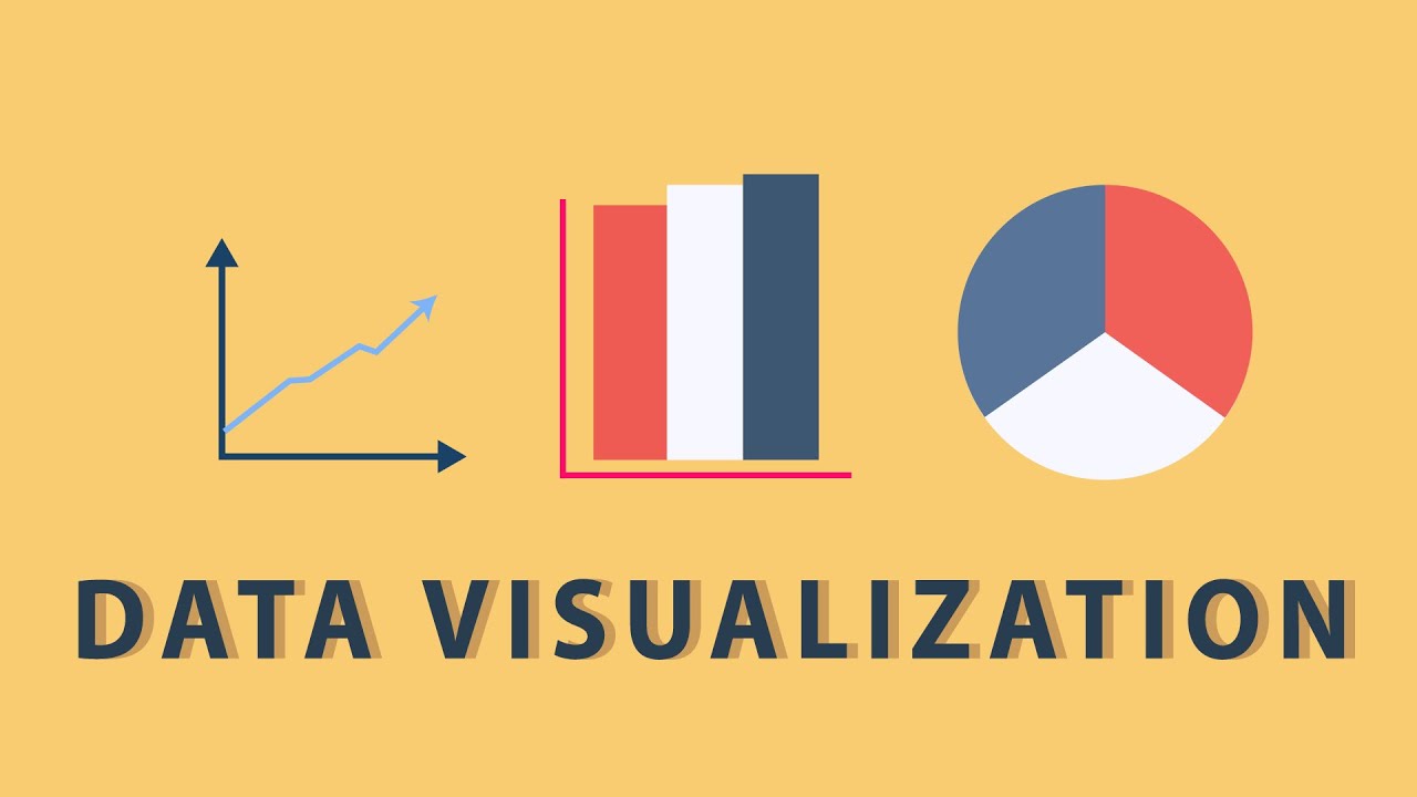
Data visualization is present in every aspect of our lives - but is it really as unbiased as it’s said to be? In this SciToons video, learn more about how data visualizations can misrepresent information. From politics to medicine, the stories told by data visualizations can bend the truth through techniques such as cherry picking, axis truncation, and pie charts that add up to over 100%.
Facebook: https://www.facebook.com/scitoons/
Twitter: https://twitter.com/sci_toons?lang=en
Instagram: https://www.instagram.com/sci_toons/
Facebook: https://www.facebook.com/scitoons/
Twitter: https://twitter.com/sci_toons?lang=en
Instagram: https://www.instagram.com/sci_toons/
Tags and Topics
Browse our collection to discover more content in these categories.
Video Information
Views
129.3K
Likes
898
Duration
4:21
Published
Jan 31, 2019
User Reviews
4.3
(25) Related Trending Topics
LIVE TRENDSRelated trending topics. Click any trend to explore more videos.
No specific trending topics match this video yet.
Explore All Trends