7 Proven Tips to Make Your Data Presentations More Impactful 📊
Discover 7 expert-backed strategies to enhance your data storytelling skills and deliver presentations that truly engage your colleagues. Say goodbye to boring charts and boost your credibility!

Jeff Su
211.2K views • Jul 13, 2021
About this video
Apparently you lose all credibility by using Pie Charts 🥧, so in this video, I share 7 Data Storytelling Tips to Improve Your Presentations to colleagues, managers, and senior leadership!
One of the most important skills to build in the workplace is to present data in an effective way. Data by itself is useless, it's how you interpret and how you present that data that will separate you from your peers. Data Visualization often means creating graphs and charts that tell a compelling story - a story that captures the audience's attention and makes them want to take action.
One of my favorite data storytelling tips is to use color purposeful to highlight one or two important elements in your slide. Our brains are wired to recognize patterns so colors are great to focusing our audience's attention. Furthermore, waterfall charts (waterfall graphs) are amazing at showing how two numbers relate to one another. This type of graph is used by many consulting firms (most notably by McKinsey Consultants).
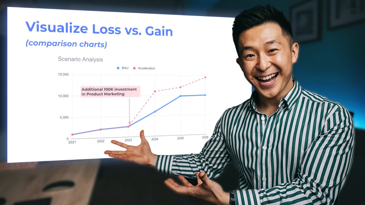
Comparison graphs are also great at bringing the data to life: What would happen if Option B happened instead of Option B? And can we put a number to the difference?
TIMESTAMPS
00:00 Why Data Storytelling Matters
00:45 Never Present a Single Number
01:37 Highlight 1 Focal Point
02:35 Use Colors
03:32 Use Consistent Formatting
04:03 When to use Comparison Charts
04:48 Use Appropriate Chart Types
06:06 Use Stickers to Protect Yourself
💪 Support this channel by becoming a member: https://www.youtube.com/channel/UCwAnu01qlnVg1Ai2AbtTMaA/join
MY FAVORITE GEAR
🎥 My YouTube Gear - https://geni.us/youtube-gear
🎒 What's In My Bag - https://geni.us/mybag
💻 What's On My Desk - https://geni.us/mydesk
🛩 What I Travel With - https://geni.us/mytravel
MY FAVORITE SOFTWARE
✍️ Skillshare - https://geni.us/skillshare-jeff
🎨 Canva - https://partner.canva.com/jeffsu
BE MY FRIEND:
📧 Subscribe to my Productivity newsletter - https://www.jeffsu.org/productivity-ping/
📸 Instagram - https://instagram.com/j.sushie
🤝 LinkedIn - https://www.linkedin.com/in/jsu05/
👋🏻 Clubhouse - https://www.joinclubhouse.com/@jsushie
👨🏻💻 WHO AM I:
I'm Jeff, a full time Product Marketer. In my spare time I like to tinker with tools and create systems that help me get things done faster - or as one of my friends puts it: "Get better at being lazy" 😏
If you'd like to talk, I'd love to hear from you. Messaging me on Instagram (@j.sushie) directly will be the quickest way to get a response!
PS: Some of the links in this description are affiliate links I get a kickback from 😇
Disclaimer: My opinions are my own and may not reflect that of my employer
#presentation #chartsandgraphs #productivityatwork
One of the most important skills to build in the workplace is to present data in an effective way. Data by itself is useless, it's how you interpret and how you present that data that will separate you from your peers. Data Visualization often means creating graphs and charts that tell a compelling story - a story that captures the audience's attention and makes them want to take action.
One of my favorite data storytelling tips is to use color purposeful to highlight one or two important elements in your slide. Our brains are wired to recognize patterns so colors are great to focusing our audience's attention. Furthermore, waterfall charts (waterfall graphs) are amazing at showing how two numbers relate to one another. This type of graph is used by many consulting firms (most notably by McKinsey Consultants).
Comparison graphs are also great at bringing the data to life: What would happen if Option B happened instead of Option B? And can we put a number to the difference?
TIMESTAMPS
00:00 Why Data Storytelling Matters
00:45 Never Present a Single Number
01:37 Highlight 1 Focal Point
02:35 Use Colors
03:32 Use Consistent Formatting
04:03 When to use Comparison Charts
04:48 Use Appropriate Chart Types
06:06 Use Stickers to Protect Yourself
💪 Support this channel by becoming a member: https://www.youtube.com/channel/UCwAnu01qlnVg1Ai2AbtTMaA/join
MY FAVORITE GEAR
🎥 My YouTube Gear - https://geni.us/youtube-gear
🎒 What's In My Bag - https://geni.us/mybag
💻 What's On My Desk - https://geni.us/mydesk
🛩 What I Travel With - https://geni.us/mytravel
MY FAVORITE SOFTWARE
✍️ Skillshare - https://geni.us/skillshare-jeff
🎨 Canva - https://partner.canva.com/jeffsu
BE MY FRIEND:
📧 Subscribe to my Productivity newsletter - https://www.jeffsu.org/productivity-ping/
📸 Instagram - https://instagram.com/j.sushie
🤝 LinkedIn - https://www.linkedin.com/in/jsu05/
👋🏻 Clubhouse - https://www.joinclubhouse.com/@jsushie
👨🏻💻 WHO AM I:
I'm Jeff, a full time Product Marketer. In my spare time I like to tinker with tools and create systems that help me get things done faster - or as one of my friends puts it: "Get better at being lazy" 😏
If you'd like to talk, I'd love to hear from you. Messaging me on Instagram (@j.sushie) directly will be the quickest way to get a response!
PS: Some of the links in this description are affiliate links I get a kickback from 😇
Disclaimer: My opinions are my own and may not reflect that of my employer
#presentation #chartsandgraphs #productivityatwork
Tags and Topics
Browse our collection to discover more content in these categories.
Video Information
Views
211.2K
Likes
7.2K
Duration
7:32
Published
Jul 13, 2021
User Reviews
4.7
(42) Related Trending Topics
LIVE TRENDSRelated trending topics. Click any trend to explore more videos.
No specific trending topics match this video yet.
Explore All Trends